Aviation operations · Product Design
Invoice pilots faster to keep operations moving.
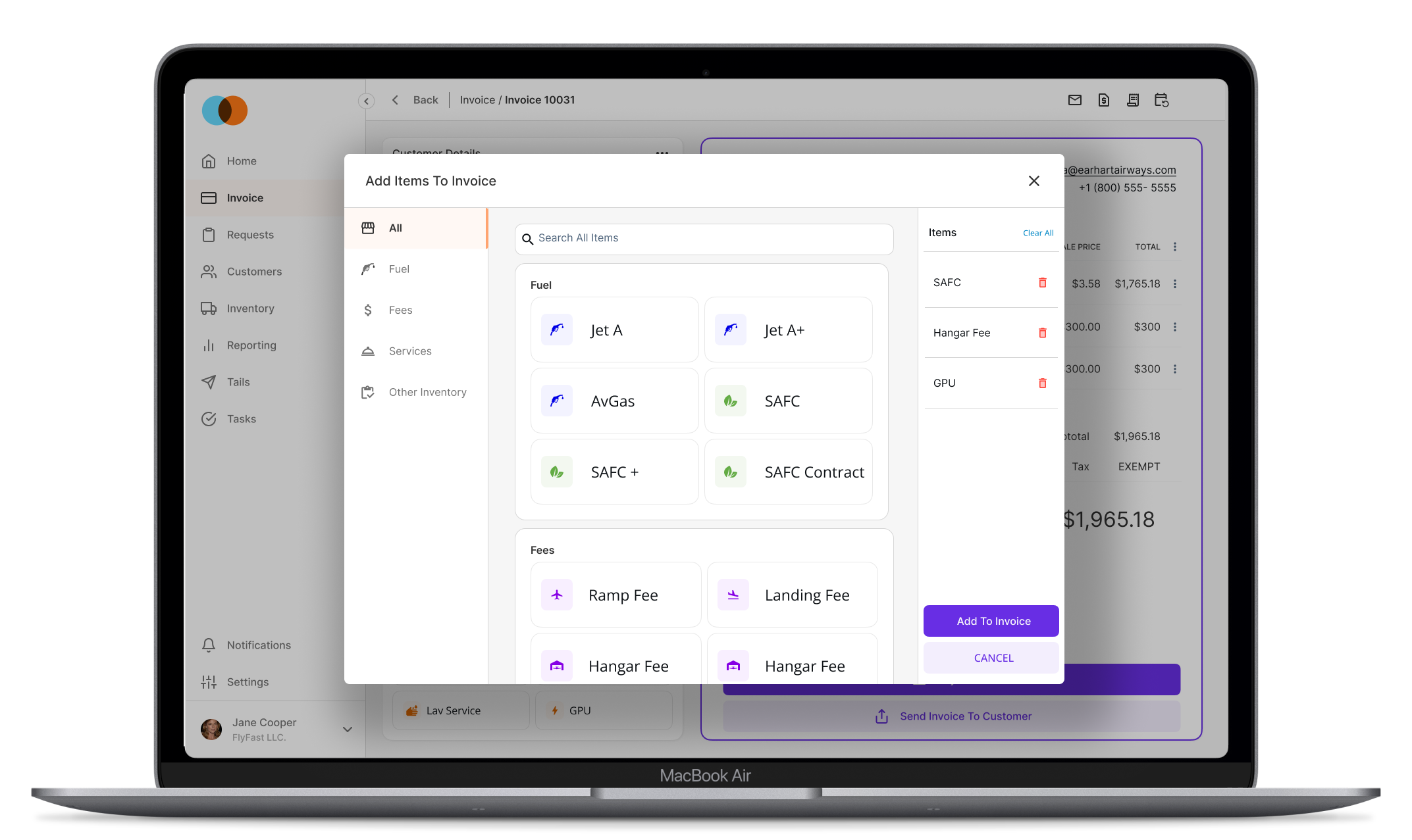
Redesigning a frustrating invoice module, the key screen in an airport operational platform, to save time and increase operational efficiency for airports and their pilot customers.
A frustrating invoice, at the center of the workflow
Anecdotally and in the analytics, we could hear and see that the current invoice design, the key module in this airport operational software, was causing frustration for our primary users and their customers (pilots).
Where time was being lost
- Manual input: a lot of information wasn't automatically ported into the invoice when a customer was created.
- Manual save: users complained about constantly hitting “save” to get updated calculations and commit their changes.
- Time on task: on busy days, users couldn't invoice their pilot customers quickly, causing frustration and delays at the airport.
- Item selection: with so many dropdowns and inputs, selecting line items took too long.
Confirming I was solving the right problem
With the anecdotal data and hypothesis in mind, the first thing I did was confirm the problems to the best of my ability, to make sure I was tackling the right ones.
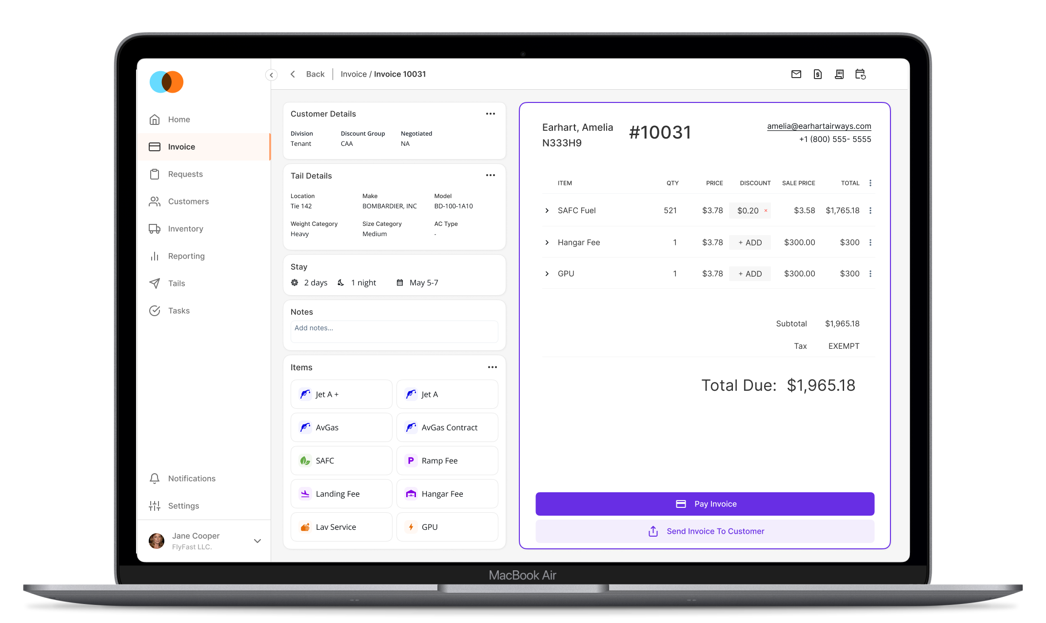
- Analytics: our behavior-analytics product showed the most-clicked buttons were Save and Save & Close. A huge eye-opener for me and key stakeholders.
- Tech-team check-in: the team confirmed they hear frequent invoicing frustrations from PO and BA, and receive many Jira tickets related to invoicing.
- PO check-in: the Product Owner and Customer Success Manager quickly confirmed and added detail to the frustrations users have with invoicing.
Learning from the best, and a beloved legacy tool
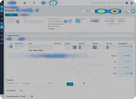
Competitive research was conducted on leading invoicing software, along with a legacy product users raved about. After an initial mid-fidelity mockup, made to check I was moving in the right direction, a stakeholder and I met with a high-volume customer and a few others.
Feedback that was feasible and consistent across customers was carried into the final design. To move quickly, we went straight to a final mockup and began development.



What the redesign had to deliver
- Autosave: remove the save buttons entirely, eliminating ~90% of the wasted clicks.
- Invoice-preview layout: users raved about an intuitive layout with an invoice preview in the legacy on-prem software; bring that clarity to the SaaS version.
- Easier line-item selection: make selection quicker and more intuitive to reduce time on task.
- Automate customer & aircraft details: pull in as much relevant information as possible so users stay in the context of the invoice instead of switching screens.
Collaborating toward a direction
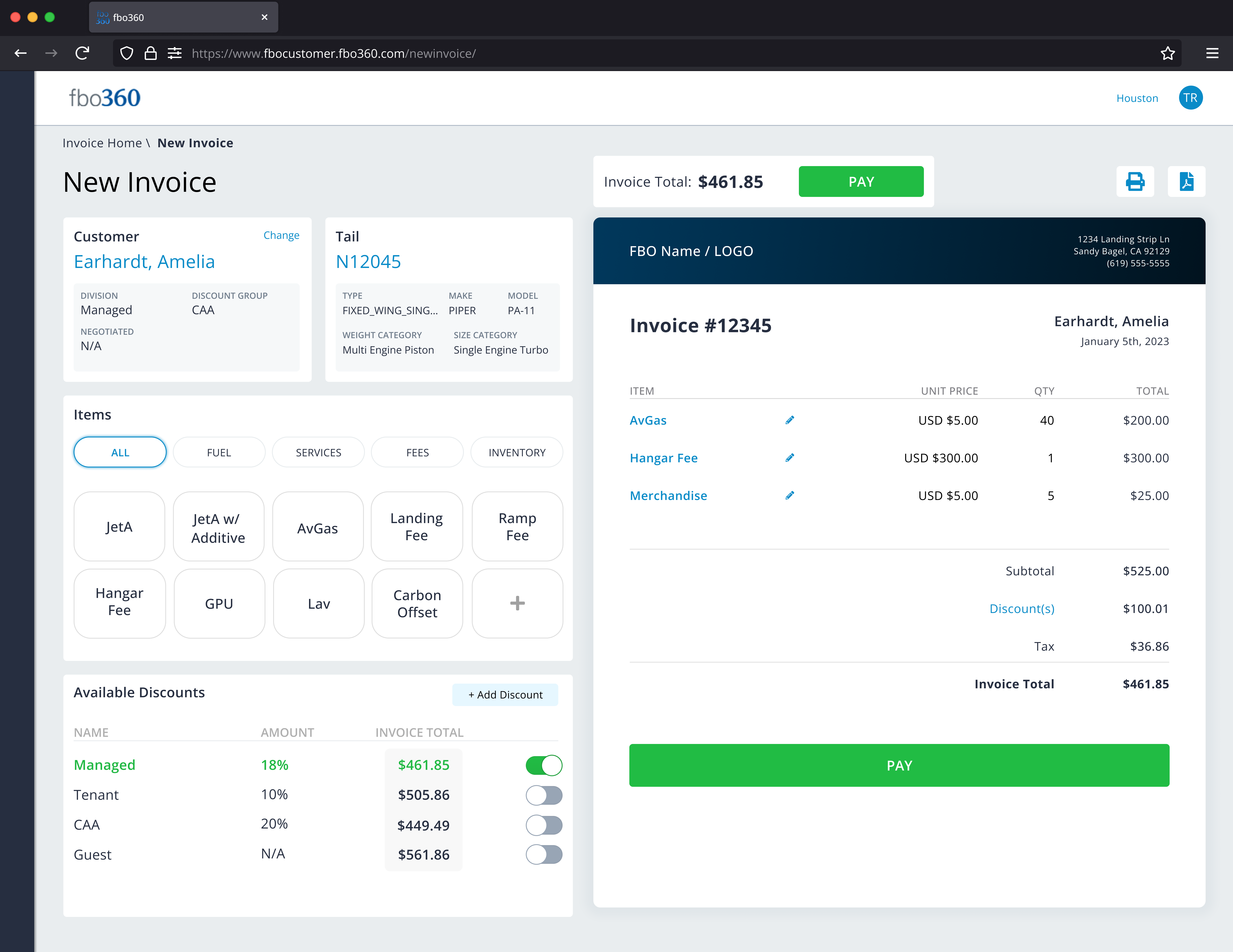
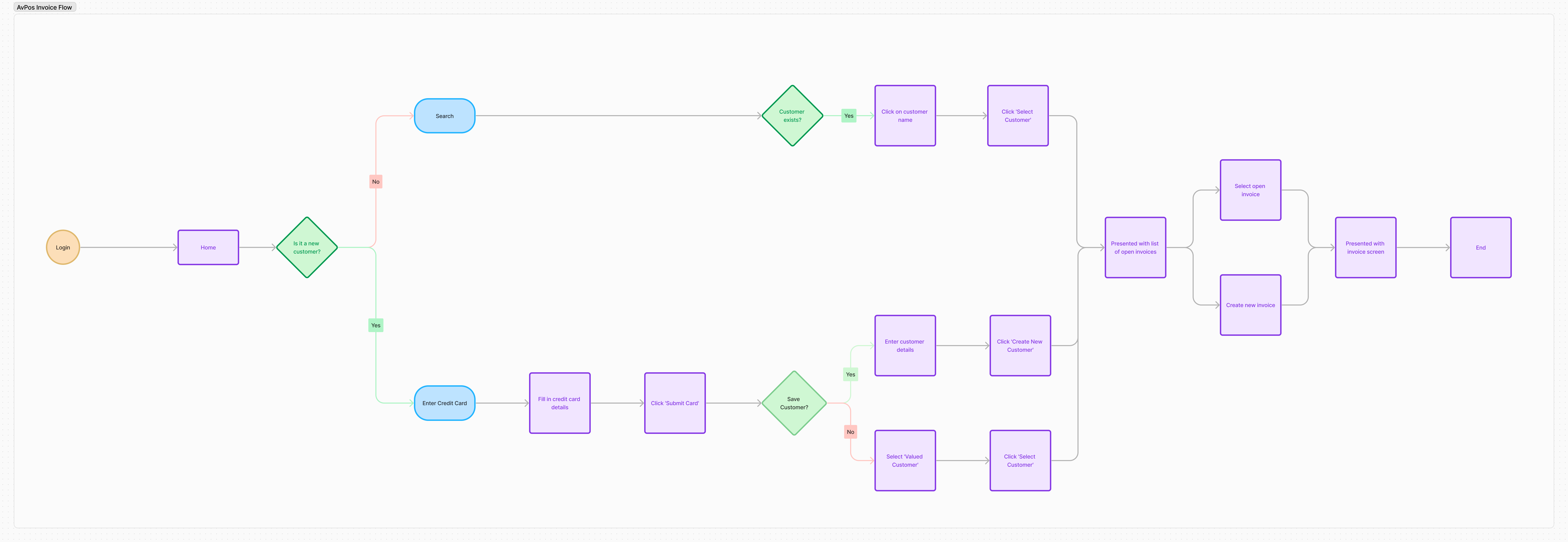
A key stakeholder had a close relationship with the high-volume customer and had already solicited feedback. Combining that with the problems we knew about, we collaborated on ideas and I began wireframing a mid-fidelity mockup with the must-have features. I also mapped the user flow to identify bottlenecks I could remove from the invoicing path.
Shipped to beta, and still iterating
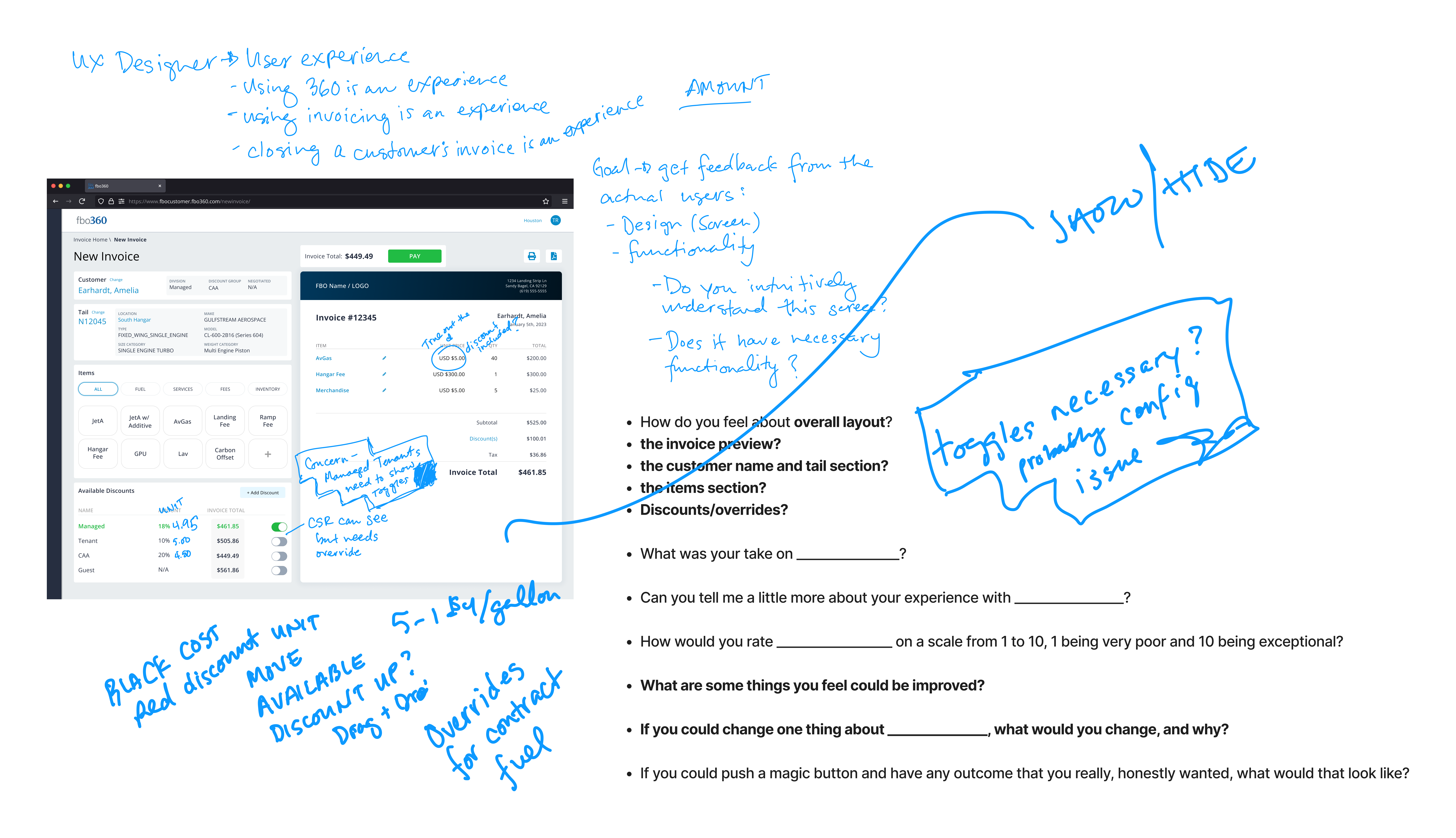
The MVP final designs went to development to be built and tested with real customers in beta. The feedback has been overwhelmingly positive, which I put down to involving customers in the research early.
That said, agile is iterative. While I'm pleased with the outcome, there are always improvements to be made, and I continue to hold customer UX feedback sessions as features release, on the invoicing module in particular.