Fintech · Mobile · Product Design
Design a remittance app to engage and retain bank customers.
Designing a competitive mobile remittance app for a niche bank, to increase customer loyalty, reduce churn, and grow remittance revenue by keeping the cross-border experience in-house.
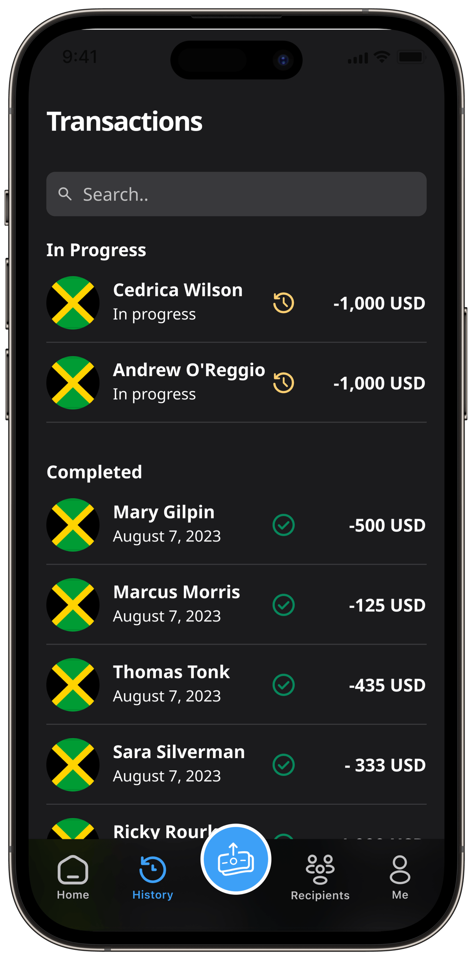
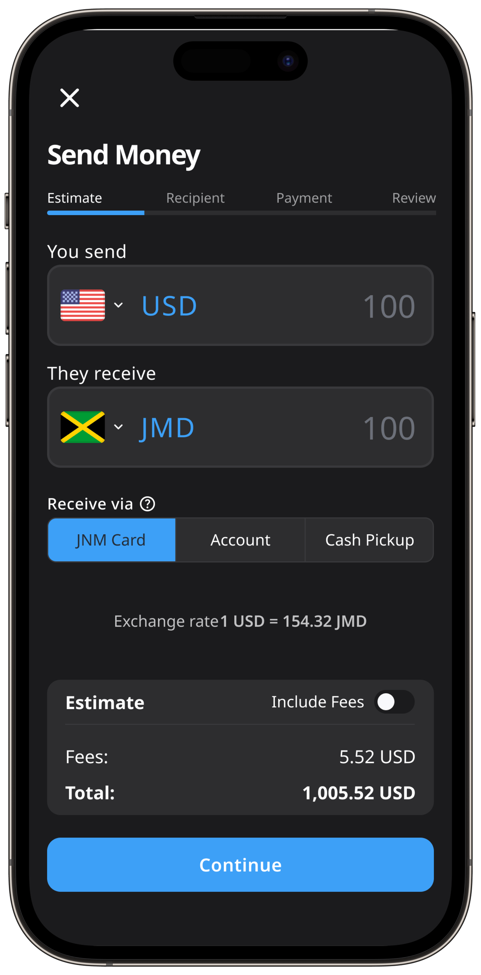
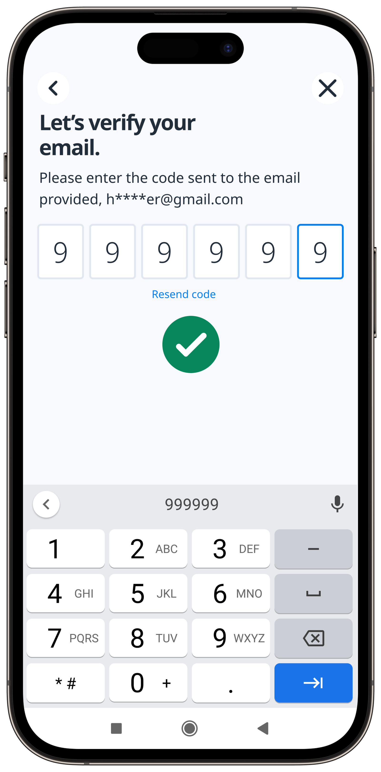
A global customer base, an experience stuck on the web
Jamaica National Bank has loyal customers across the globe, which means many of them send money across borders, into Jamaica and out of it. But the current remittance experience isn't designed for mobile and is cumbersome on the web.
If JNB could release a mobile app that competes with Wise, PayPal, and MoneyGram, they could keep the remittance experience in-house, increasing customer satisfaction while growing revenue.
What was driving customers away
- Poor mobile experience: the web-based application is clunky on mobile, forcing many users onto a PC to complete the task.
- Account required: to even view capabilities or estimate a send, users had to create an account first.
- High barrier to entry: beyond account creation, JNB asked for a lot of personal information and documentation before users could start or explore, leading to burnout and churn.
Benchmarking against the industry
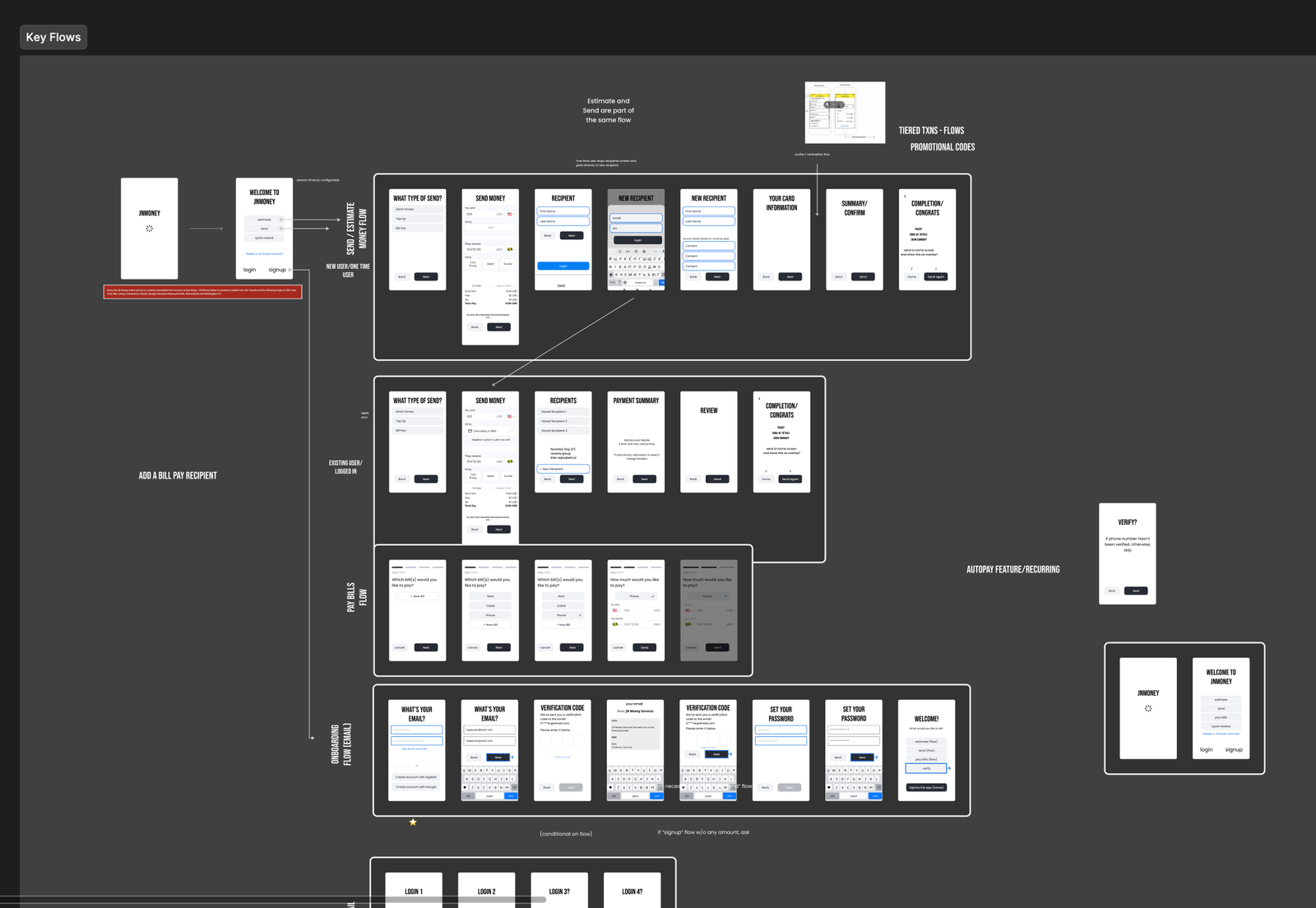
After listening to the client share their needs and perceived issues, I ran a competitive analysis against industry leaders in remittance and peer-to-peer payments. I laid out all the key screens and flows from those leaders, which let me observe how they approach layout, structure, user flows, and requirements.
Aligning with the client on direction
I gathered the findings and presented them to the client. This let us align on what we were seeing and confirm the conceptual and experience-level direction we wanted to pursue.
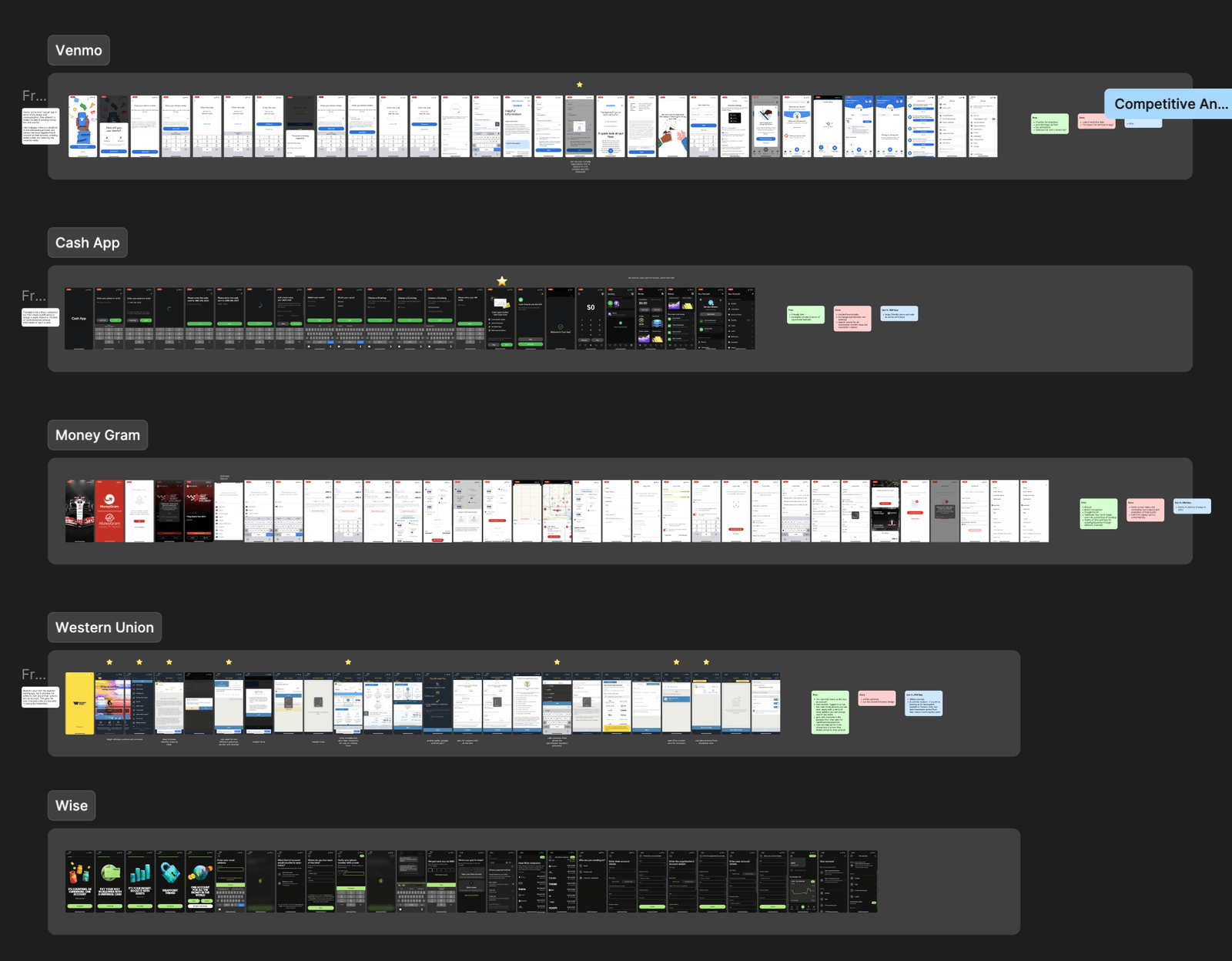
Three patterns the leaders shared
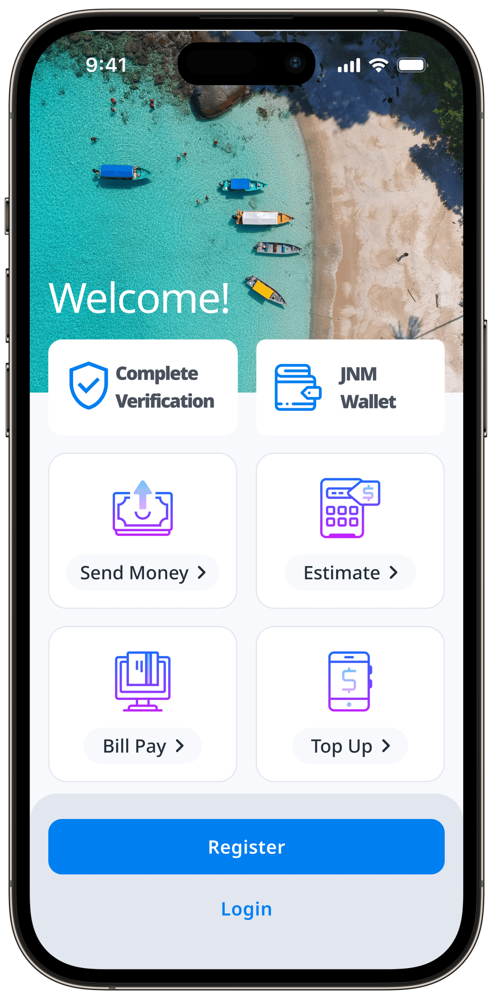
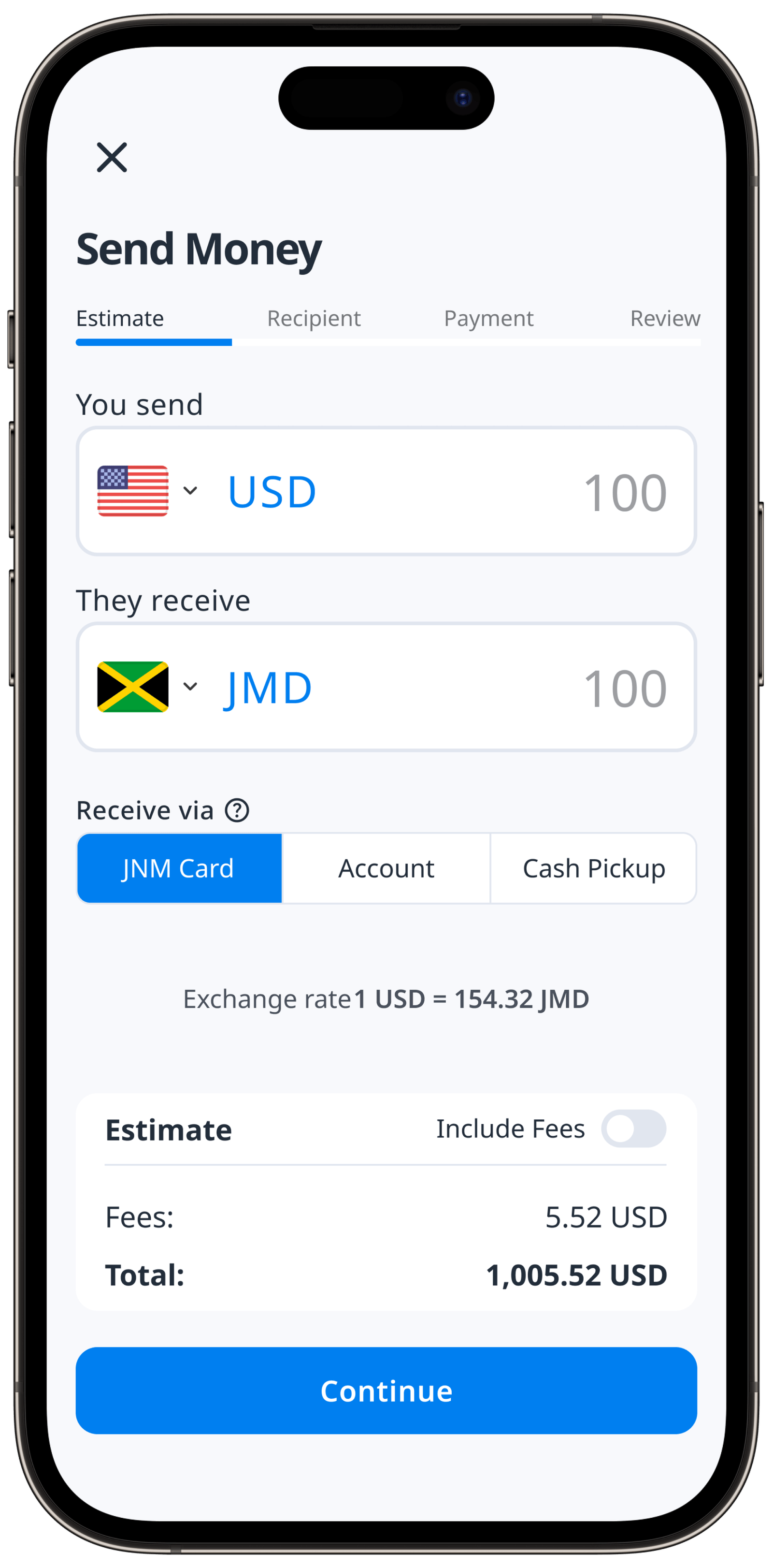
- Access without an account: most apps let potential users start the path of sending money before creating an account, previewing the app and building commitment to action.
- Bite-size data requests: leaders asked for information mostly when needed to complete a task, letting users add data in the flow of a send request.
- Low barrier to entry: users could start each key action from the very first screen, before signing in.
Designing for three kinds of sender
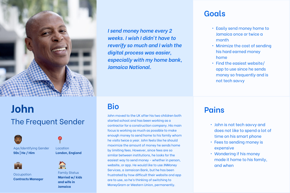
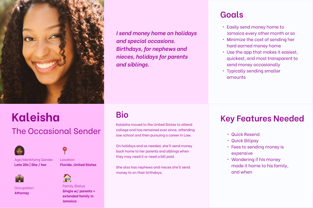
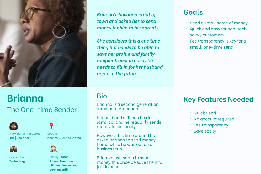
After the competitive research, I synced with the client's product team on target personas. They didn't have hard user data available, so I relied on their anecdotes and descriptions of key demographics to shape three personas. It became clear we had to accommodate frequent senders, one-time senders, and non-tech-savvy users.
Mapping the information hierarchy
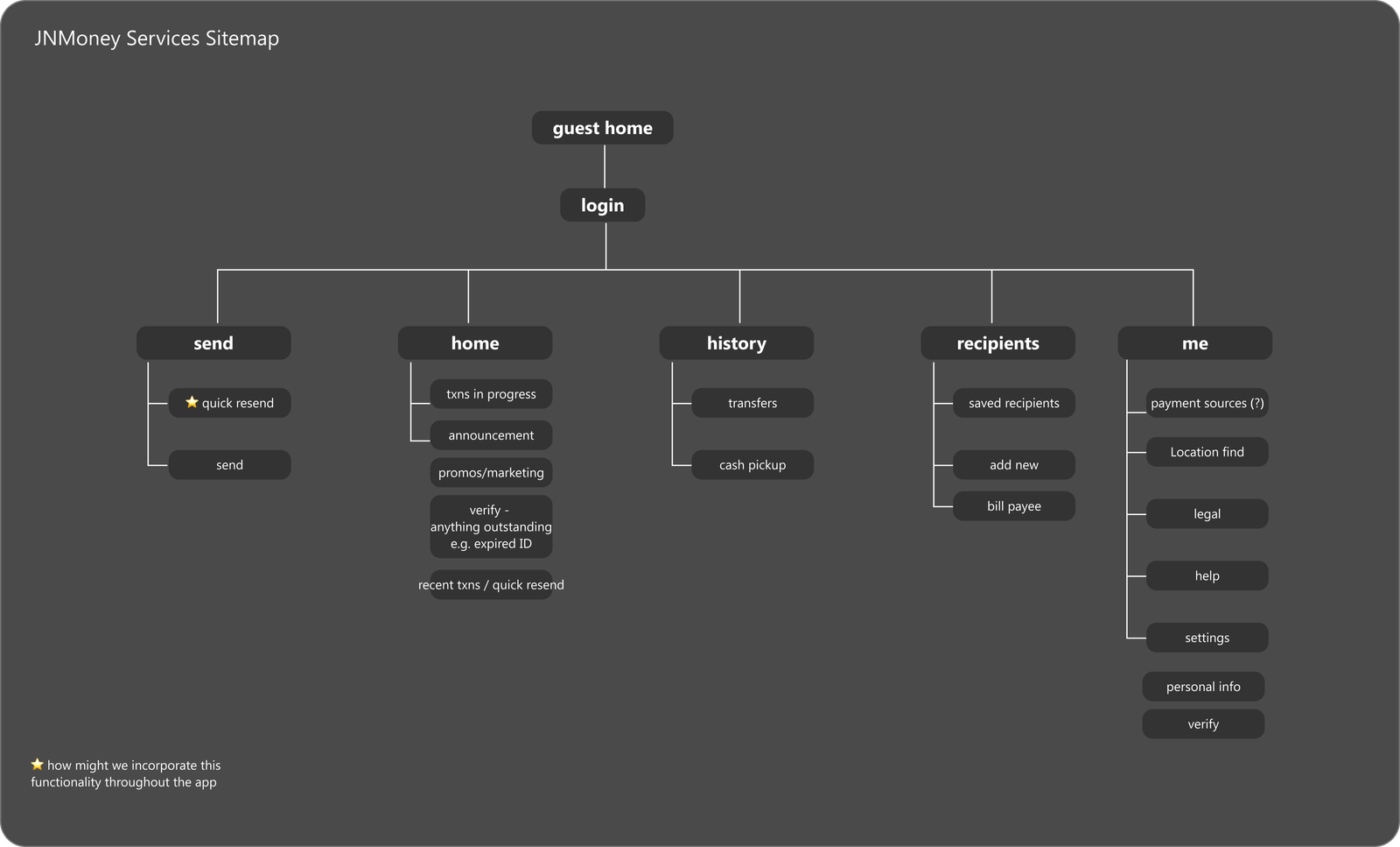
With personas set and competitive research complete, I built the sitemap to clarify the information hierarchy and started the key low-fidelity wireflows, grounding the layout in the patterns that reduce friction for first-time and returning users alike.
A lean system to set the client up for success
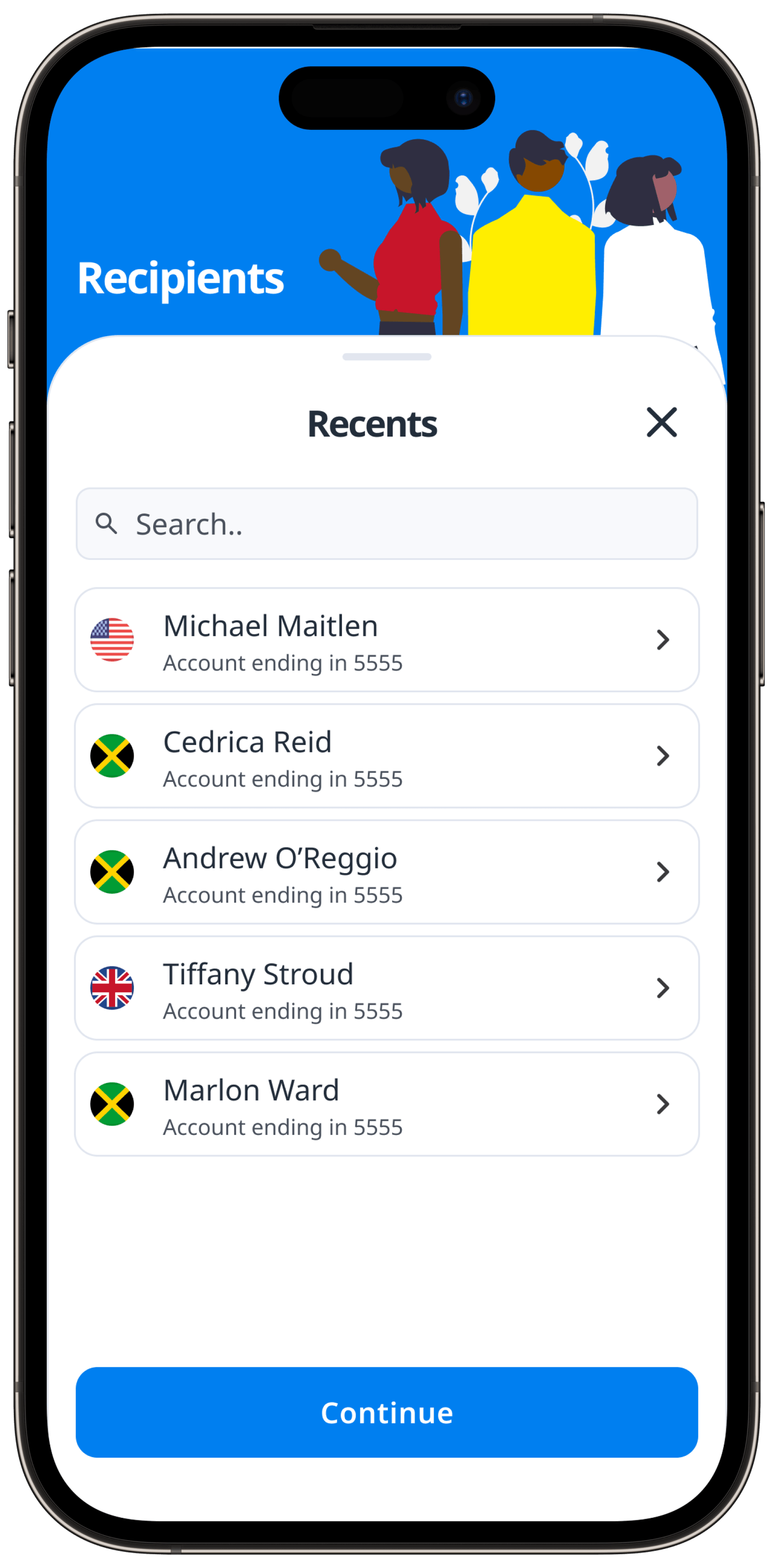
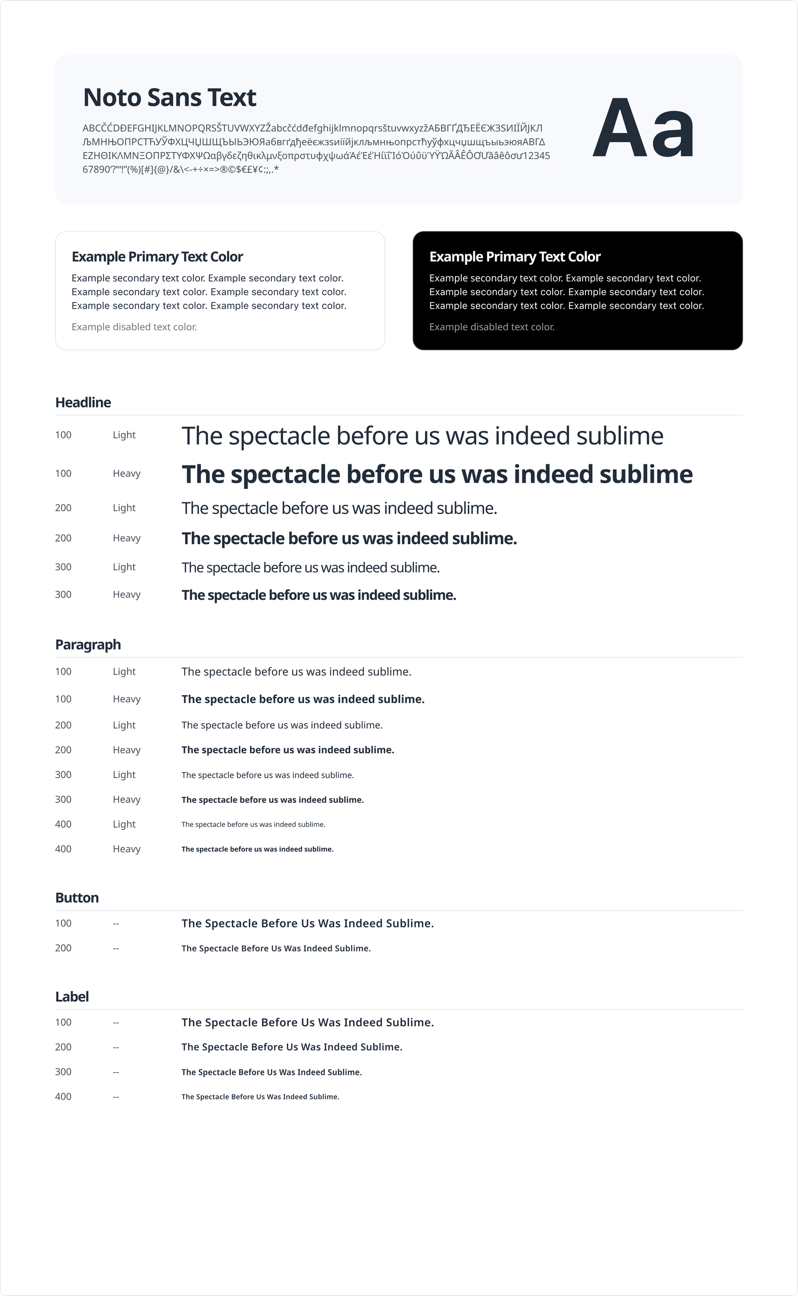
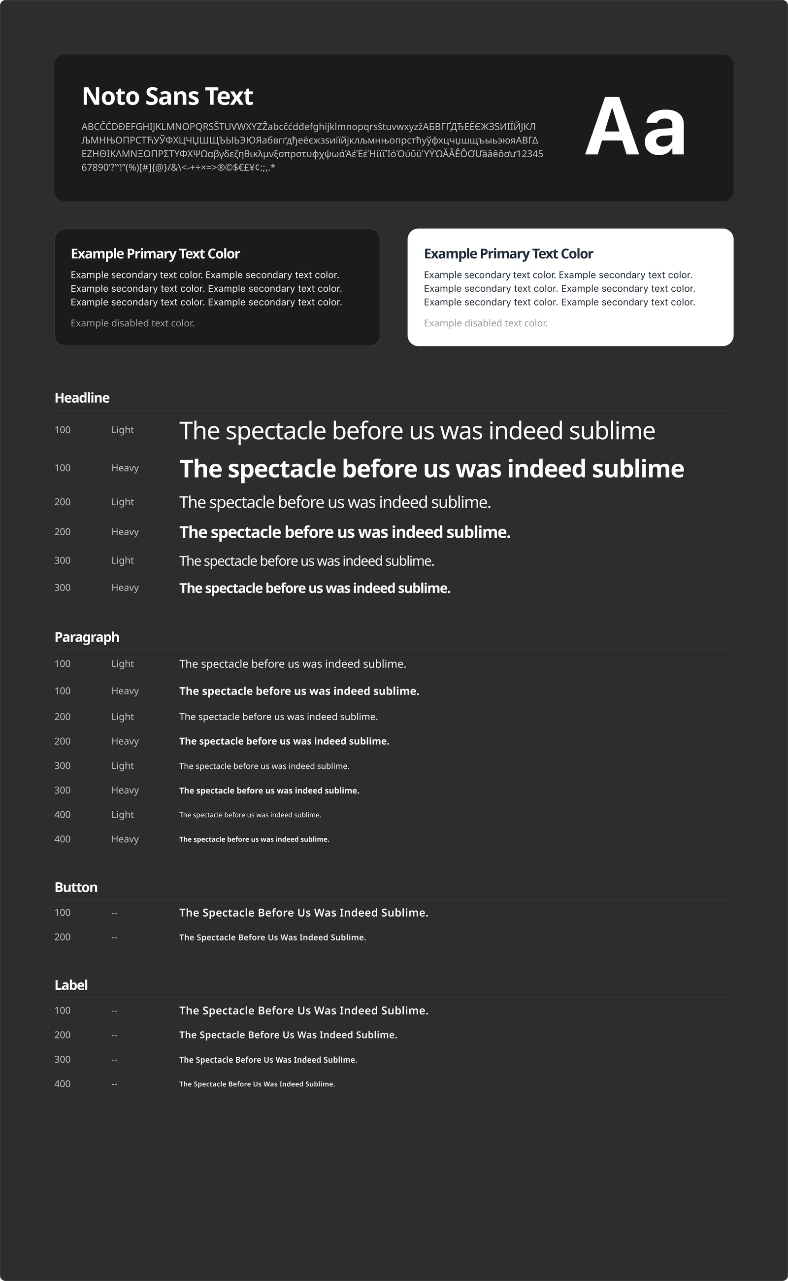
Even a minimal design system in a limited engagement can set a client and development team up for success. I ran colors, font families, inputs, illustrations, and icons past the client. They wanted illustrations but didn't want to hire an illustrator, so we used an approved open-source illustration library and photography.
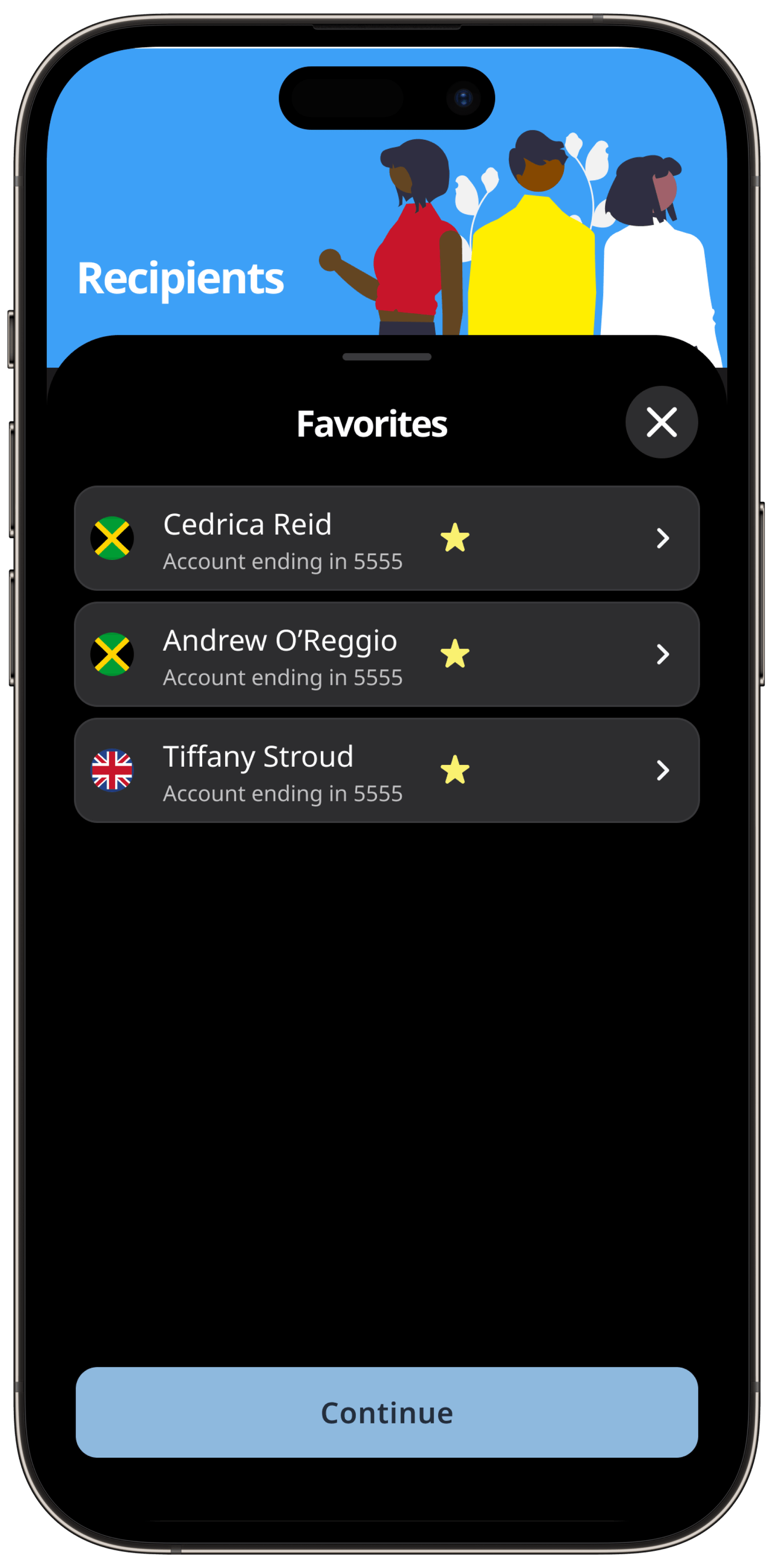
By setting color variables in Figma, it was easy to design light and dark modes at the same time.
Delivered, prototyped, and ready for dev
Final delivery is always iterative. After continuous meetings throughout the process, one final review, and prototyping the key flows, the final designs were delivered. I also provided the development team with instructions for using Figma Dev Mode, including plugins that assist with code generation.